A fast, conversion-focused landing page designed to empowers teachers connect, teach, and grow across borders.
Brand
Uteach
Industry
Education Technology
Timeline
3 Weeks
Tools Used
Figma, Elementor, WordPress, Canva, Sketchpad
About This Project
The explosion of remote learning platforms created incredible opportunity, but also serious noise. Uteach was imagined as an all-in-one teaching platform that cuts through that noise and helps solo educators and institutions teach, connect, and grow.
I wanted to design a landing page that didn’t just look good, but made it incredibly easy for:
Teachers to understand the platform’s value
Students to trust the brand
Users from anywhere in the world to take action quickly
Design Process
Laying the Groundwork
Before designing anything, I looked at the top platforms: Teachable, Thinkific, Kajabi. They all had impressive features, but each of them missed something.
Platform
Strength
Weakness
Teachable
Clear CTA, nice visuals
Too impersonal
Thinkific
Rich media, good testimonials
Overwhelming info density
Kajabi
Polished branding
CTAs hidden behind jargon
What I learned:
Keep messaging direct and emotionally relevant
Don’t let design get in the way of action
Put real humans—teachers and learners front and center
The Challenge
As I studied the EdTech space, a few things stood out. Many websites talked a lot, but said very little. Pages felt either too corporate or too chaotic. And most importantly, they weren’t designed for conversion.
So I reframed the challenge like this:
How might we create a landing page that’s globally accessible, emotionally engaging, and instantly useful, without overwhelming the user?
I knew I had to find the balance between trust-building storytelling and clean, actionable UX.
Challenge Highlights
Create a landing page that speaks clearly to both educators and learners. Build instant trust, communicate value in seconds, and guide users to act without overwhelming them with complexity.
The old site looked generic and unbranded — it failed to build confidence in a premium coaching offer
Visitors didn’t know what was being offered or what action to take — leading to confusion and drop-offs.
Mobile layout broke in key areas, with slow load times and clunky usability on small screens
The Solution
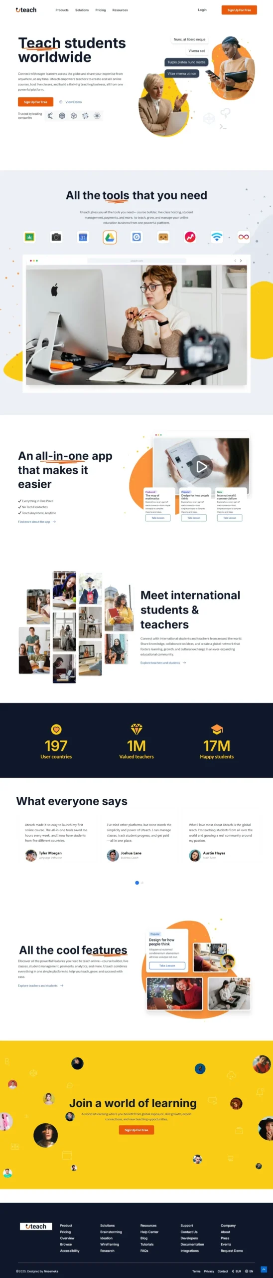
I approached the Uteach landing page like a guided story: each section moves the user forward, building belief and momentum.
Here’s how the journey unfolds:
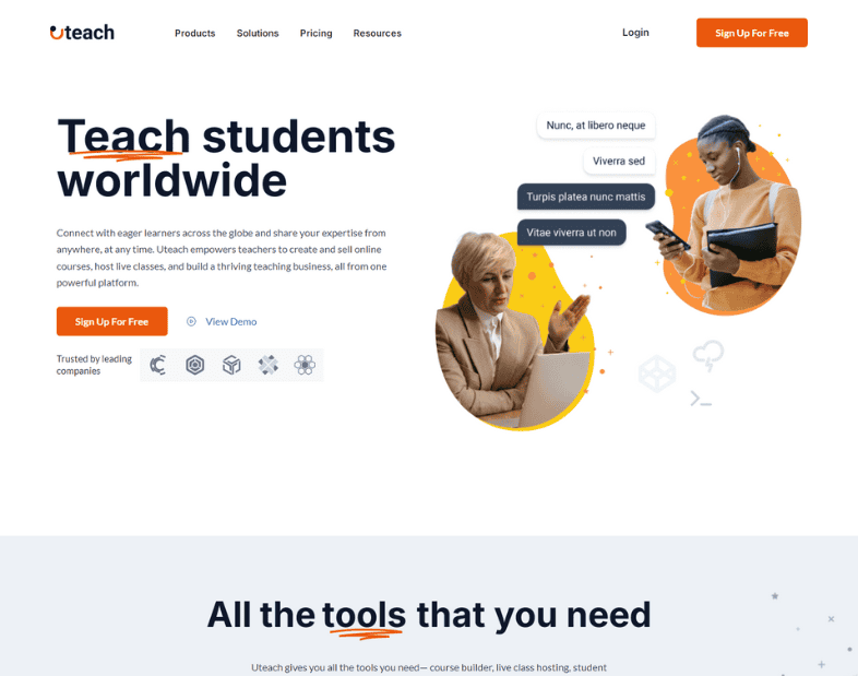
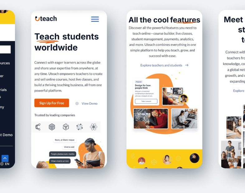
1. Hook – “Teach students worldwide.”
A strong, bold headline that instantly answers “what is this?” Backed by friendly imagery, subtle chat bubbles, and a clear CTA: Sign Up for Free.
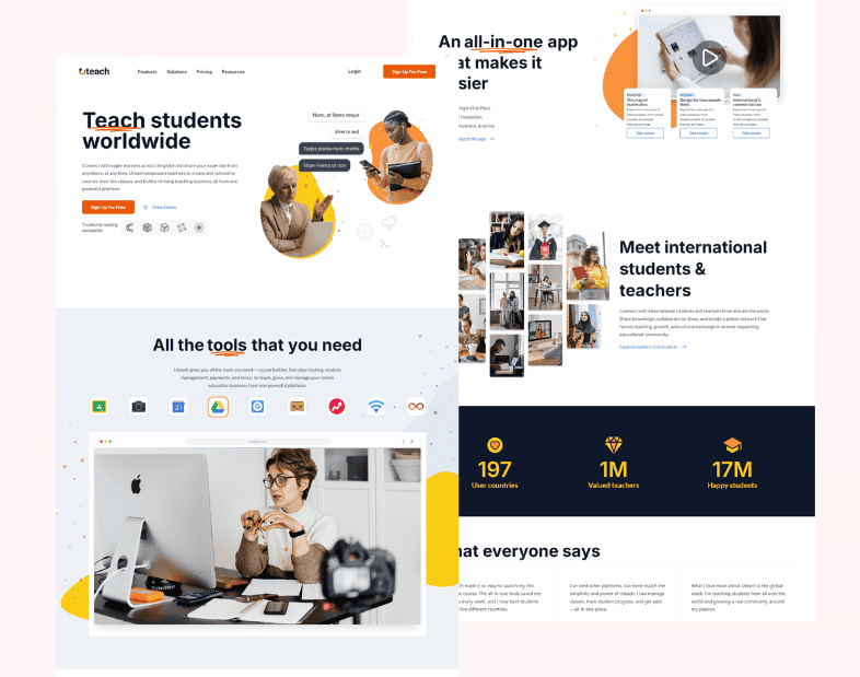
2. Trust & Tools
Rather than just listing features, I framed them as what you get to succeed: Video hosting, quizzes, automation, payments, CRM… all in one place. Simple icons helped users recognize tools at a glance.
3. Show the Experience
Instead of listing benefits, I showed the product in use a teacher recording content, a student learning. These lifestyle visuals humanized the platform.
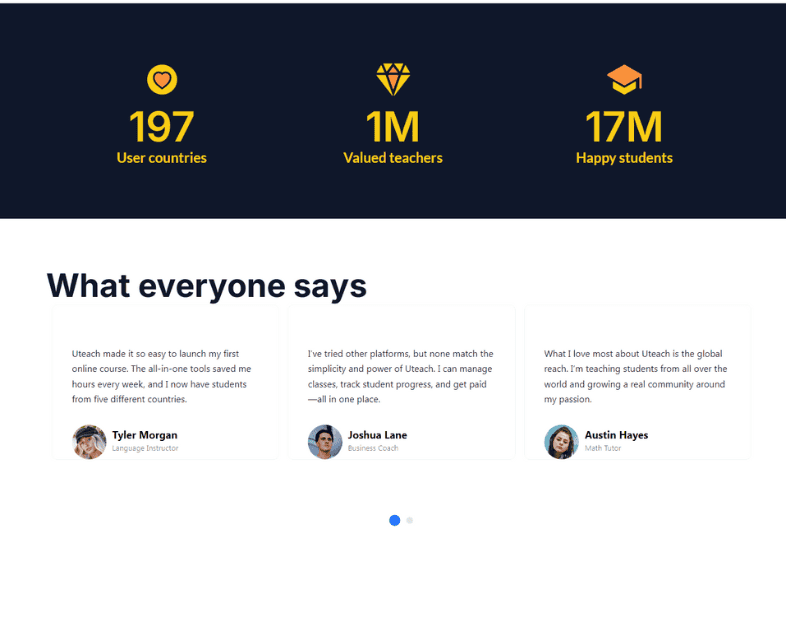
4. The Big Picture
Uteach is global
To drive credibility, I added a stat block:
🌍 197 countries
👨🏫 1 million teachers
🎓 17 million students
That wasn’t just data, it was proof this platform matters.
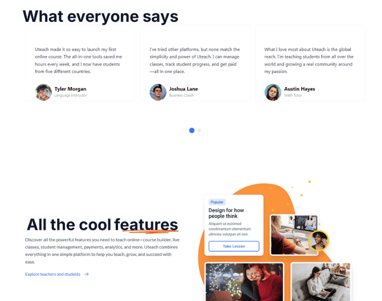
5. What Everyone Says
No pitch is complete without real voices. I included testimonials with avatars and job roles so that visitors could see themselves in those stories.
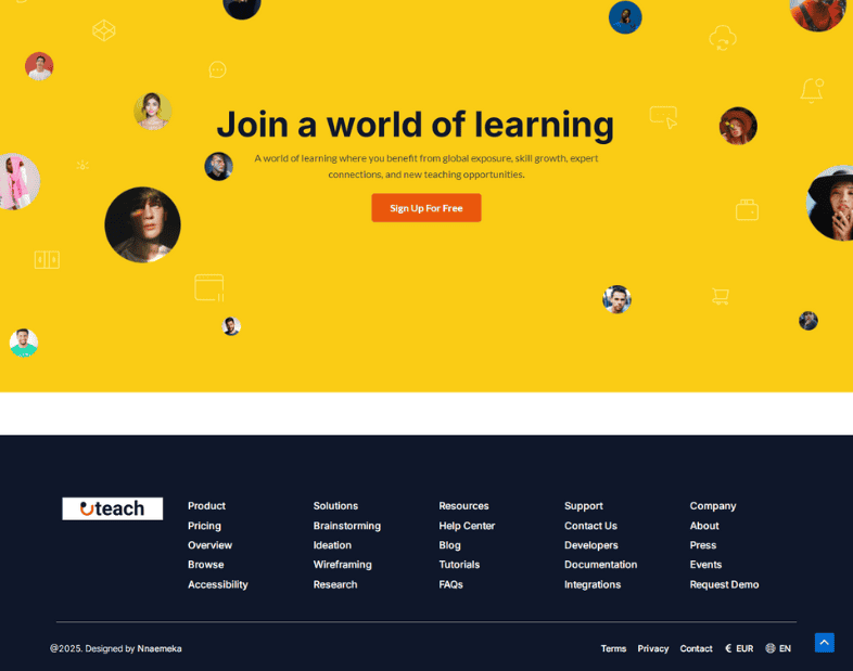
6. Final Push – A World of Learning
To wrap up, a vibrant yellow section pulls everything together with a clear final message:
“Join a world of learning.” One CTA. No distractions.
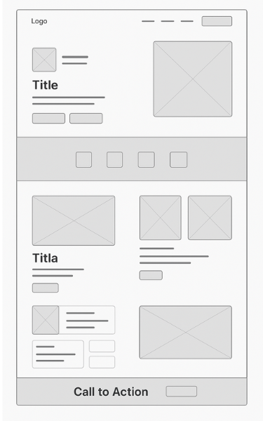
Design Decisions That Made It Work
wireframe
Colors: I used bright yellows and oranges for optimism and action, balanced with white space to keep it breathable.
⚪ White (#FFFFFF) & Light Gray (#F5F7FA)
Dominates the background for a clean, breathable layout.
🟠 Orange (#FF6B00 to #FF7A00 range)
Used for buttons (e.g., “Sign Up for Free”), icons, and call-to-action highlights. It gives the design a warm, energetic, and action-driven feel.
Typography: Bold headlines made scanning effortless, while body text remained neutral and friendly
Imagery: Photos of real people and learning contexts kept things grounded in reality
Spacing & Rhythm: Each section had space to breathe, guiding the eye instead of overwhelming it
Mobile-first design ensured nothing got lost on smaller screens.
Testing the Flow
Before calling it done, I walked 6 users, 3 educators, 3 students through the page. I watched where they paused, what confused them, and where they clicked first.
Feedback Highlights:
“It feels welcoming and not too techy.”
“The icons helped me get what it does really fast.”
“I clicked ‘Sign Up’ without even scrolling all the way.”
Adjustments Made:
Reordered one section for better scroll logic
Added video preview earlier in the experience
Strengthened CTA contrast in mobile view
The Outcome
What This Project Achieved
By the end of the project, Uteach became more than just a polished landing page, it became a story, a journey, and a real reflection of what modern EdTech can feel like when done right.
The final design didn’t just look professional, it was purposeful, emotionally grounded, and conversion-ready. Every section had a job. Every visual had a reason. And most importantly, it spoke directly to the people who needed it most, teachers trying to grow their reach and students searching for a place to learn.
The flow was smooth, the message was clear, and the visuals felt human and inviting. You didn’t have to scroll endlessly or second-guess the platform’s value. The structure guided you, the content connected with you, and the call to action gave you something to do next, with confidence.
And though it was a concept project, it didn’t feel like one. It felt like a real product, solving a real need, with design that was both functional and inspiring.
This landing page achieved:
A clear and compelling user journey, from first impression to final action
A layout that respected the user’s time, while still delivering depth
A visual identity that felt friendly, modern, and globally inclusive
A well-balanced mix of trust-building (testimonials, data) and value communication (features, benefits)
A mobile-first experience that worked just as well in the hand as it did on desktop
One Last Thought...
This project was one that stretched me but in the best way possible, mehn!
Designing Uteach wasn’t just about getting layouts and color palettes right. It was about putting myself in the shoes of two very different users—teachers and learners—and finding a way to speak to both, clearly and respectfully.
There were moments when the layout felt too cluttered. Or the message didn’t quite land. I had to go back, tweak, test, and ask:
“If I were using this for the first time, would I trust it?”
That question became my compass.
Uteach reminded me why I love what I do. It’s not just the visuals. It’s the storytelling. The structure. The moment someone scrolls and thinks, “Ah, this feels made for me.”
That’s the win. That’s the goal.
And now that this is behind me, with the experience I have gained, I’m more confident and excited than ever for what’s next.
And… thats a rap!
Let’s Design Your Next High-Converting Page
Whether you're a coach, creator, or professional, I’ll help you turn clicks into clients with clean, strategic design.