Magnifico is an innovative digital platform designed to connect teachers with students worldwide, streamline workflow, and enhance the online educational experience.
Brand
Magnifico
Industry
SaaS (Team Productivity & Collaboration)
Timeline
2 weeks
Tools Used
Figma, Elementor, WordPress, Canva, Adobe Photoshop, Google Fonts
About This Project
As remote work became the norm, teams across industries needed better ways to stay aligned, productive, and connected, no matter where they were. Communication was scattered. Workflows became fragmented. And collaboration often slowed down just when it mattered most.
Magnifico was built to solve that. It’s a modern team collaboration platform that brings structure to teamwork. From planning to execution, it equips teams with intuitive tools to manage projects, share knowledge, and solve problems together, faster and smarter.
Objectives
Craft a visually compelling and accessible landing page.
Communicate benefits and features with clarity.
Encourage user signups and onboarding through strategic calls to action.
Build trust and foster community around the product.
Design Process
Getting Inside the User’s Head
The process started with research, not just into the product, but into the people using it. I studied competitors, explored UI patterns across SaaS leaders, and built user personas focused around team leads, project managers, and remote-first organizations.
What stood out was this: productivity tools often feel cold. This platform was different, it had warmth. It had flow. The landing page had to reflect that.
Challenges
Initial user adaptation to new technology.
Balancing feature complexity with user-friendly design.
Scalability of onboarding resources for global audiences.
Lessons Learned
Ongoing user feedback is crucial for refinement.
Simplicity in design contributes to higher engagement.
Building a supportive community helps in retention and satisfaction.
Approach & Strategy
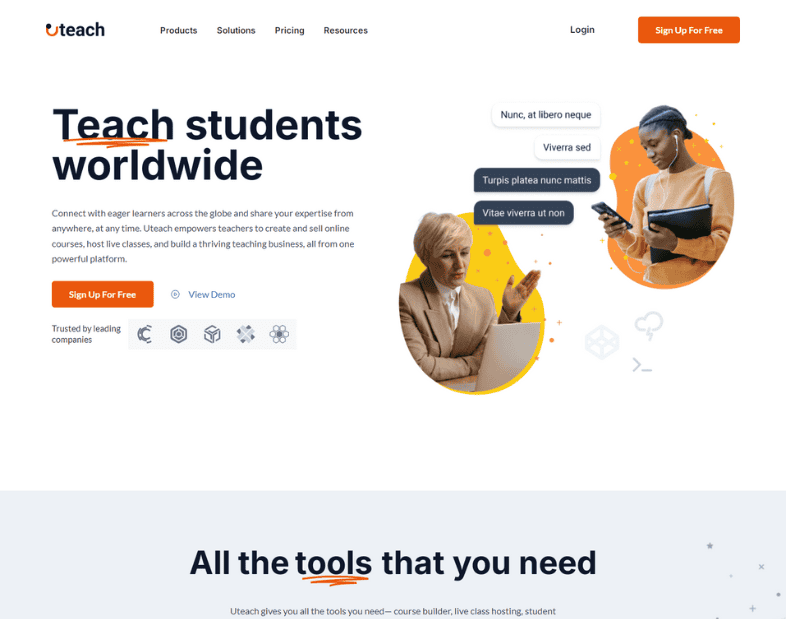
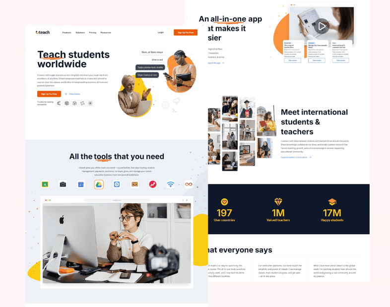
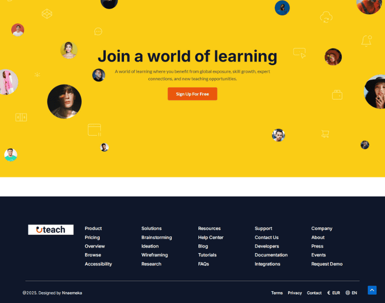
This project focused on effortless clarity. I began by stripping back the noise and narrowing in on the key touchpoints users needed to see first, what Magnifico does, how it helps teams, and why it stands out.
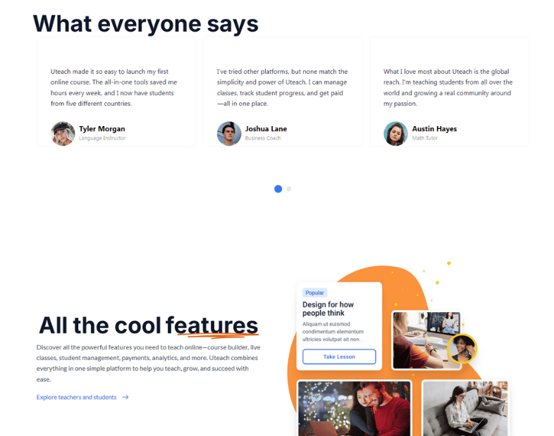
The structure is built on repetition and rhythm. The eye is guided across content types, text, visuals, stats, and call-to-actions without ever feeling lost or bombarded.
To bring everything together, I developed a content structure based on empathy. Sections like “Enjoy your time working” and “Problems come and get solved with ease” speak directly to pain points while also reflecting what success looks like for the user.
Visual Language
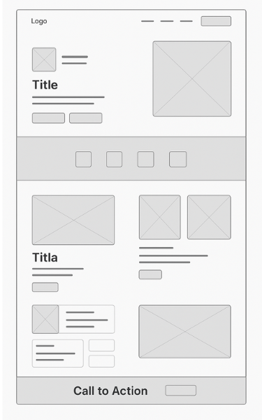
wireframe
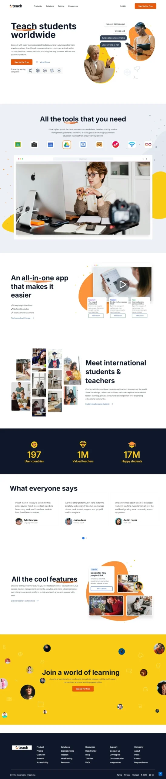
Chose a clean, modern color palette with purples and blues for trust and innovation.
Used abundant white space and subtle gradients for readability and focus.
Selected images that depict diverse, dynamic teams in authentic work scenarios.
Employed easy-to-read, sans-serif typography for accessibility.
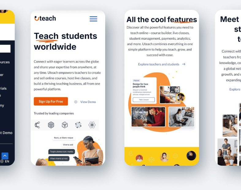
Prototyping and Real-World Readiness
Once the visual direction was approved, I developed fully interactive prototypes. Every detail was tested for responsiveness, mobile breakpoints, navigation clarity, and scroll behavior.
Transitions were kept subtle. Buttons were placed exactly where motivation peaks.
CTAs were never aggressive. They were supportive, inviting. And always visible.
The Outcome
What This Project Achieved
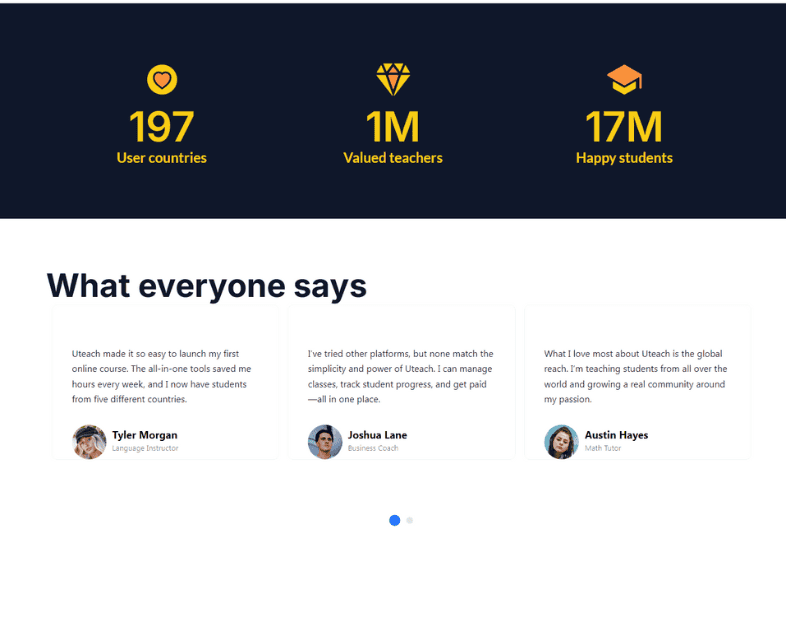
Launched a sleek, persuasive website reinforcing the brand’s mission of team empowerment and frictionless collaboration.
Achieved a balance between aesthetic appeal and usability, resulting in higher engagement metrics post-launch.
Created a scalable and modular design adaptable for future updates or feature expansions.
What I Delivered
Full end-to-end design: research, UX wireframes, UI mockups, and responsive prototypes.
Visual assets supporting inclusive, professional, and energetic team imagery.
Consultation on information architecture and copy flow for clarity and persuasion.
Reflection
This project demonstrates my strengths in turning complex requirements into intuitive, attractive web experiences. The final website showcases a conversion-driven, community-focused approach and serves as a portfolio highlight for modern B2B SaaS product design.
I came away with an even deeper appreciation for how landing pages function as both entry points and storytelling tools. The final design isn’t just a place to sign up. It’s a place to believe in the product.
Let’s Design Your Next High-Converting Page
Whether you're a coach, creator, or professional, I’ll help you turn clicks into clients with clean, strategic design.